So far, so good
Time off at work = time to brainstorm
As this week has progressed, I have finally decided on the topic of the double page spread and drafted to possible designs for it. The topic will be "The Perfect Moscow Mule". How I decided on this topic was really quite easy. I considered three factors: 1. How well it photographs, 2. My accessibility to the tools needed, 3. Type of article it is. Points one and two overlap in the sense that since I own Moscow Mule cups and I have seen my parents make them, I know how aesthetically pleasing they are and how easy they would be to recreate for a picture. The third point I considered was the fact that doing this article would mean doing a recipe, which is a key element of any food magazine. Doing so would allow me to shine the light on the techniques used to present recipes and combine that with the higher end and luxurious feel of the magazine. Furthermore, this week I also had time to draft the possible layout for the double page spread. Here is how I want it to look like:


I like the first design because it is bold. It allows me to give the magazine a bit more of an artistic look since it gives the fonts room to shine. This is something hard to accomplish, but, if done right it can take the magazine to the next level. I am ready to commit my time to a series of trials and errors to try different fonts and see how they pair together, after all fonts are just as important as the images. As graphic designer Luke Tonge said, "Magazines are a marriage of pictures and words. If fonts are the clothes that words wear, it stands to reason you'll want your text suitably attired." The other aspect that stands out from this layout is the fact that each step has a small illustration next to it. This is an idea I got from looking at different cocktail articles. These hand hand-made doodles (6:00) that gave the piece depth and a more human touch. The touch of humanity serves in showing that this recipe is genuine and can be trusted, something graphic designers claim to be true. Here are some examples I've seen:
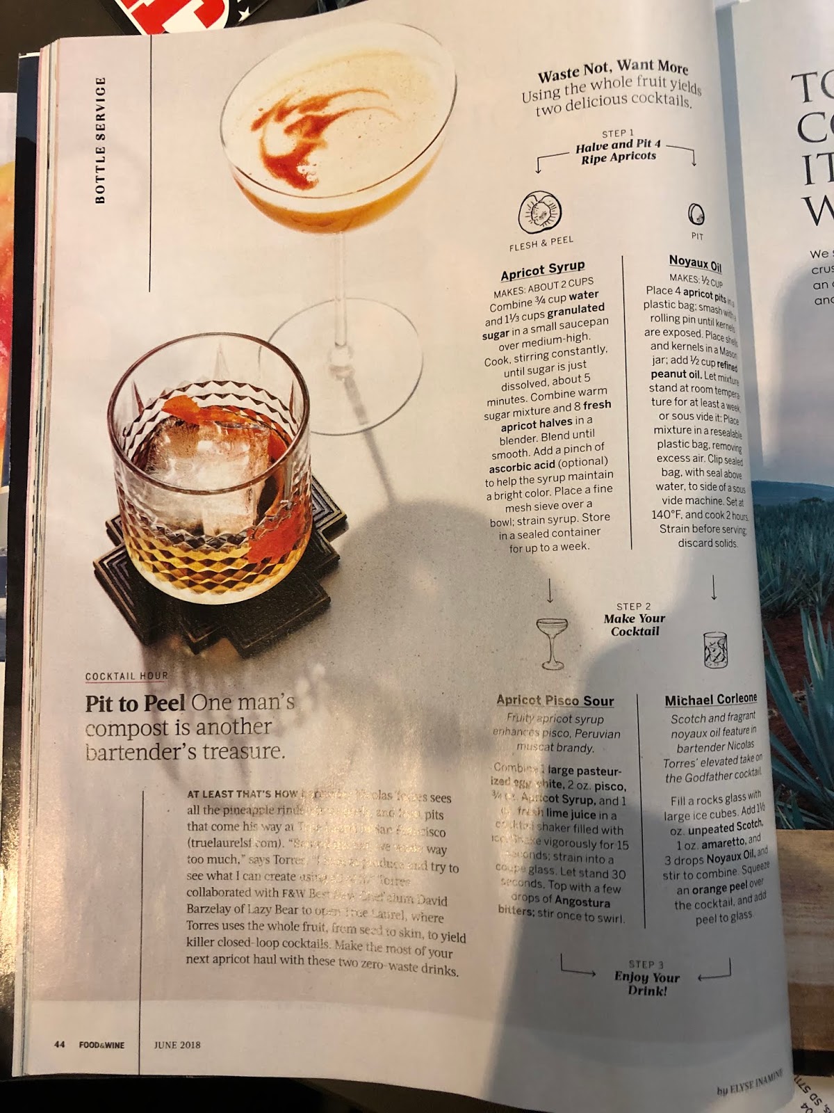

The idea of using arrows to guide the recipe also came from the example of Food & Wine magazine. Any way, the second design I made is more simplistic, and places greater emphasis in the picture rather than the font of the title. Here's where the inspiration came from:

I like the fact that in this concept, the words that would have a bigger type face are "Moscow Mule," since they would clearly show what's most important to the article and draw the attention of a reader that is quickly scanning through pages. Unlike the picture I included above, also from Food & Wine magazine, I would reserve the text for the next page and simply put a caption to the image.
In the next post I will hopefully have more to share with you, fingers crossed.
P.S. Being that my dad used to work for a company that owned several brands of alcoholic beverages, finding the recipe for a Moscow Mule was easy, since he already knew it and could share it with me. Of course this is only for the purposes of the text, I won't be making the actual recipe for pictures.


No comments:
Post a Comment