Thursday, March 28, 2019

Last photoshoot

I see the end!!

Today I took the pictures for the article and I also got a chance to get the picture of the bar I needed for my TOC. I left my camera at home so I had to take the picture of the bar with my phone, but it came out pretty good. I was able to get a shot of the bar with the bar tender, the decorations and some people in the back. Here's how it came out:


And here it is after editing...


The difference between the two is not monumental, but it does make a difference. I made the green pop out more so that the picture is more colorful. i also cropped out the trash cans and the other bartender so it looks more clean and professional. 

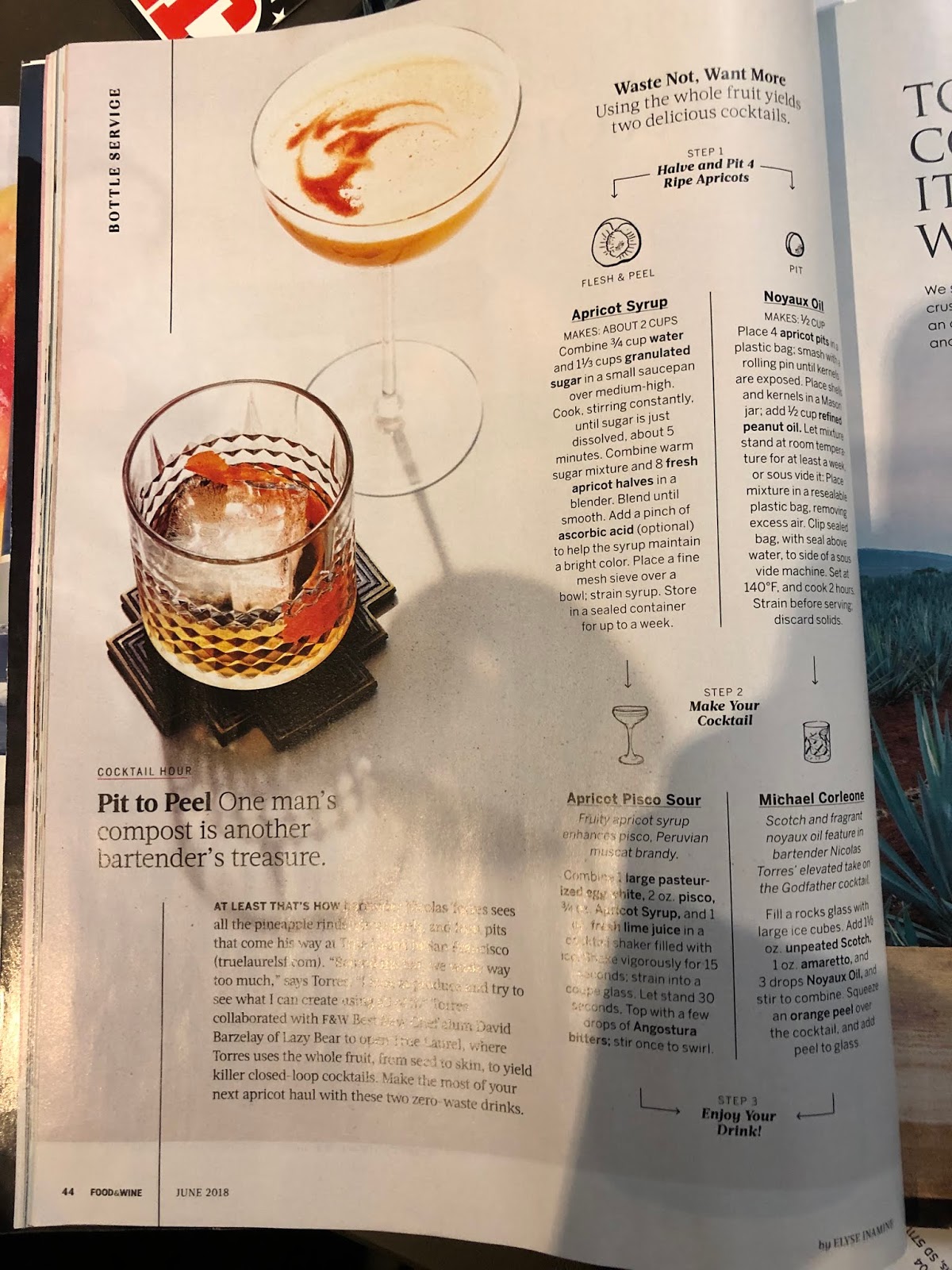
Now, let's look at the pictures for the article. I had to make sure I took a picture that could be cropped practically in half (vertically) and still show all the elements I wanted it too. In order to ensure I got this down, I made a template and put in a picture as a place holder. I used the picture that was the placeholder as a guide and set up my subjects similarly. Here's the picture I had as a place holder and the set up I put:


As you can see, I decided to take the light box outside. It was a very sunny day and I was able to use all natural light for the pictures, which looked very nice. Using direct sunlight would have been too much, so the layers of the box helped diffuse the light. I took the pictures from a slight high angle in order to show the contents of the mugs and hide the fact that I used a wooden board and not a whole wooden table. Here are my favorite pictures from the shoot:


Now I have to decide which one fits best, edit it and continue working on the article. 
I have already found some sources that have useful content for the article. Also, another thing I had planned to do this week was find any graphic I needed, so I went ahead and looked for "hand-drawn" illustrations in one of my favorite websites: The Noun Project. The Noun Project is a library of royalty free icons for personal use. I found an icon of a lemon and some ice cubes that I think would fit perfectly in the article... for now I won't show them and keep you intrigued until next week. My next post (I PROMISE) will be my article all finished and polished. Hold on to your seats because the best is coming. 


Tuesday, March 26, 2019

So far, so good

Time off at work = time to brainstorm

As this week has progressed, I have finally decided on the topic of the double page spread and drafted to possible designs for it. The topic will be "The Perfect Moscow Mule". How I decided on this topic was really quite easy. I considered three factors: 1. How well it photographs, 2. My accessibility to the tools needed, 3. Type of article it is. Points one and two overlap in the sense that since I own Moscow Mule cups and I have seen my parents make them, I know how aesthetically pleasing they are and how easy they would be to recreate for a picture. The third point I considered was the fact that doing this article would mean doing a recipe, which is a key element of any food magazine. Doing so would allow me to shine the light on the techniques used to present recipes and combine that with the higher end and luxurious feel of the magazine. Furthermore, this week I also had time to draft the possible layout for the double page spread. Here is how I want it to look like:


I like the first design because it is bold. It allows me to give the magazine a bit more of an artistic look since it gives the fonts room to shine. This is something hard to accomplish, but, if done right it can take the magazine to the next level. I am ready to commit my time to a series of trials and errors to try different fonts and see how they pair together, after all fonts are just as important as the images. As graphic designer Luke Tonge said, "Magazines are a marriage of pictures and words. If fonts are the clothes that words wear, it stands to reason you'll want your text suitably attired." The other aspect that stands out from this layout is the fact that each step has a small illustration next to it. This is an idea I got from looking at different cocktail articles. These hand hand-made doodles (6:00) that gave the piece depth and a more human touch. The touch of humanity serves in showing that this recipe is genuine and can be trusted, something graphic designers claim to be true. Here are some examples I've seen:


The idea of using arrows to guide the recipe also came from the example of Food & Wine magazine. Any way, the second design I made is more simplistic, and places greater emphasis in the picture rather than the font of the title. Here's where the inspiration came from: 

I like the fact that in this concept, the words that would have a bigger type face are "Moscow Mule," since they would clearly show what's most important to the article and draw the attention of a reader that is quickly scanning through pages. Unlike the picture I included above, also from Food & Wine magazine, I would reserve the text for the next page and simply put a caption to the image. 

In the next post I will hopefully have more to share with you, fingers crossed.

P.S. Being that my dad used to work for a company that owned several brands of alcoholic beverages, finding the recipe for a Moscow Mule was easy, since he already knew it and could share it with me. Of course this is only for the purposes of the text, I won't be making the actual recipe for pictures. 


Sunday, March 24, 2019

The final round begins

I see the end...

Alright, I first want to acknowledge the fact that this week was extremely productive. With what I did, I am set up to only have to worry about the double page spread and any final adjustments I choose to do. Who knows, maybe I'll even have extra time to do a little extra (an ad :) perhaps). With this last post I want to plan out what I plan to do this week. This week will be less active since my school is on break. However, it won't completely halt the process. For example, this week I will finally be able to get a picture of the bar I need for the TOC. I am going to be working in the Miami Open Tennis Tournament as a ball person, which means I will have access to beautiful restaurants and bars that have been set up for the tournament. I already scouted the lot and think this bar will do the job:


It is a rooftop bar and it fits the aesthetic of being high class. In the picture it looks empty and a bit disorganized, which is why I want to go when there's customers. I'll keep you updated on that. Anyway, here's what I plan to do this week:
  • Decide on the topic for the double page spread. 
  • Plan the pictures and graphics needed.
  • Take pictures for it.
  • And if time allows... write the article... or at least a draft of it.
I don't know if I am being too ambitious with these goals, but for now I'll try to meet them. 

P.S. I have thought about what I want to do for the double page spread but I am torn because I am drawn to many different articles. In the end, I think I'll go for the one I can do better in terms of having the resources to photograph it. 

Friday, March 22, 2019

THE TOC

I think.

As promised on my last post, I worked on the TOC and added the missing pieces. I kept the general layout I had planned and simply added the list of articles I had drafted. There were some slight changes to the names of the articles and I also decided to bring my magazine up to 126 pages because I needed to fit one more article. Let's take a look at it.


Isn't she a beauty? 
Anyway, let's break it down like we did with the cover. First, let me address the changes I made to the original draft. I added the name of the magazine as a header on the left hand corner to give a better idea of the brand identity through every page. Plus, it is something I have seen in some magazines such as this one I picked up on Barnes and Noble recently. 


This magazine is within my genre of high class magazines, so it fits the conventions. I also changed the color of the "What's inside?" to match the color of the raspberries in the main picture and continue to be cohesive with playing with pink hues (as seen in the page numbers). Another change I had to make was changing the font and font size for the author names. When I first drafted the magazine TOC, I thought using the same font for everything on the TOC would be a good idea, but I was wrong. Here is how it looked:


I felt like using the same font looked too over powering and took away from the minimalistic feel of the magazine. Something needed to change, so I decided to change the author names (since they are not nearly as important as the article names) and make them smaller and sans serif. This change quickly took the TOC to where I wanted to be: minimalistic and easy on the eyes. It also draws more attention to the article names which are the central focus of the TOC.
Those were all the changes I made to the TOC. I kept the rest as I had it and only adjusted page numbers and added the pictures. I am really happy with the way in turned out and I think the pictures fit well together as they vary from pictures taken indoors and outdoors. The colors also fit well as there is contrast between them. 
P.S. As you may or may not have noticed by now, the middle picture, the one of the bar, hasn't changed. That's because I am waiting to find a restaurant with a nice bar in order to take a picture of it. Once I do that, the TOC will officially be completed! 

Wednesday, March 20, 2019

THE COVER

No subheading needed

This is one of those posts you might want to bookmark. This is one of those posts that mark a milestone in the process. It's a big day. Why? I finished the cover and WOW. I. Love. It. Let's take a look at it.


Now, let's break it down. As you can see, I kept the general layout I had designed previously. All I did was add the cover lines and the picture I took. The picture fit perfectly because it fits right in the middle, making the subject the main focus. For the placement of the cover lines, I drew inspiration from an example I had put earlier on this blog as well as a food magazine I found on Barnes and Noble. These were the covers I took a look at:


From the Bon Appetit cover, I took the idea of having the cover lines interact with the picture. With this in mind, I easily found three more articles that could be related to the picture other than the main article. This gives the magazine a sense of cohesion and leaves it clear that the cocktail issue is indeed about anything and everything there is to know about cocktails. From this cover, I was also inspired to stick to a rather monochromatic color scheme to give it an artistic look. As for the cover of THRIVE, I drew the inspiration to play with the fonts and wrap them around the subject of the picture. This gives the cover a more playful look while contributing to the artistic look. In terms of the font and colors of the cover lines, I decided to stick to minimalistic color choices with minimal pops of color. The reason behind this decision is that it keeps the cover clean and minimalistic, a common convention in luxurious and high end magazines. Furthermore, I kept the use of serif fonts to a minimum so they wouldn't steal the spotlight from the mast head of clash too much with each other.
I am very happy with the way it turned out because it fits the image of a high end magazine while also looking artistic and not taking away from the fact that it is a food magazine. :)))

NEXT: The TOC


Monday, March 18, 2019

The reveal

Of some pictures :)

I know you all have probably been waiting for me to upload some of the pictures I took for the TOC and the cover. Luckily, I have had time to upload them to my computer and share them with you. I have also taken the time to edit the brightness and clarity of these pictures using the app VSCO on my phone. The app allows you to edit exposure, contrast, clarity, saturation and tone. I used this to brighten up some of the pictures I took, especially for the cover, since I felt they were too dark. Here is what a before and after for the cover looks like:


As you can see, the picture on the right is much darker and the hues of orange in it are not as saturated. This is something I edited to make the picture look much brighter and appealing. Overall, the picture for the cover came out almost like I had pictured it. The only problem I had was the light but I think that was fixed through editing, and once I put it in the cover and add the cover lines, it should be fine. I am also very happy with the fact that the color I used for the cover matches my previous research of maintaining a monotone color scheme (which in this case are the orange and brown hues) that make the image clean and artistic. Also, the glass is centered around the center third of the grid, making it perfect to place cover lines around it and make it the center of attention.

P.S on the cover: If you look closely, there is a line in the background that is simply a wrinkle in the cloth. I edited this out using the Photoshop Mix app on my phone. 

Alright, moving on the the pictures for the TOC.

These pictures are bright and colorful, which I think will give the TOC life. They came out pretty much like I had planned them to come out. Here are they (after being edited on VSCO):


I am very happy with how they turned out... we just have to wait and see how they fit into the TOC. On the next post, however, I will be working on finalizing the cover. I just wanted to sneak a peek of the future of the TOC.

Saturday, March 16, 2019

Photoshoot day

Despite all odds, it didn't rain!

It was forecasted to rain on the day I took the pictures, so I was freaking out because this would mean falling behind on my schedule, something I simply couldn't afford. The day began with me trying to figure out how to make a colorful-looking "cocktail" for which I ended up using food coloring and a bit of lime. From there, things started to fall into place my drink looked good enough to be a nice splash of color. 


I shot this cocktail in my backyard to put it into the place where it would belong: a BBQ on sunny spring day. For this, I asked a friend to help me by being a faceless model that was simply stirring the drinks and moving them around. Despite him being in the shot, the pictures had a shallow focus that blurred him out and showed the drink more clearly. 
For the shots I used my dad's Sony RX100 camera. It's not a professional camera, but it is easy to use and pictures actually come out looking great. 
Next, I worked on the shot of the champagne, glasses and used two very elegant and different-looking glasses that I think will elevate the feel of the magazine. I set this shot my the window which had dispersed light coming in through the shadows of the tree. I can't wait to show you how these came out, because I think I really did justice to how beautiful the glasses are. Look at them:
After the champagne shot, I recreated the picture of the pineapples I have as a place holder, but set it by the lake to give it a more "spring-y" feel. This shot was challenging because first of all, I was running out of ice so I had to get creative... and second of all, the table was slanted so everything was sliding off. Luckily, my friend helped my hold the table still and I got some shots I think will work. BTW the little ice I had melted while I went to get new batteries... so you really cant see the drink :(

And finally, I shot the cover page pictures. For this, I had to carve some ice to make a nice, big cube that looks like something Don Draper would use to make an old fashioned. 
Anyway, for the cover page shot I used a light box set up I borrowed from a friend. This was helpful in giving the shot a solid background, something that is common and expected of food magazines. If the background was busy with things like flowers and nature, it would be hard to fit the cover lines. Also, using a light box allowed me to play around with light and give it some natural looks and some artificial looks. (Let's ignore the fact that one of the lights had smoke coming out of it by the end... woops!)

I definitely think I got some good shots yesterday and cannot wait to show you guys. Until next time!!


Friday, March 15, 2019

Picture planning

FYI: I'm not very good at drawing

Hey there! Today you'll be lucky enough to see my ability to draw, and the fact that I am too confident in my abilities as I did the drawings in pen. No room for erasing anything. Anyway, the things I have sketched are the picture for the cover and the shots I want to get for the TOC. During my research, I found this very useful blog post titled: How to use compositional techniques to improves your food photography. One of the suggestions on the page was to actually draw out the shots you want to get in order to have a clearer vision. The page also asked you to consider the grid while photographing and recommended finding a balance between looking staged and understanding where your subject is going to be the most pleasing and powerful to the viewers eye. Keeping these things in mind, I set up the following shots:


For the cover page, I plan on using a white (or light) background and have the drink be in the center, drawing all the attention to it. The drink will be surrounded by "accessories" so the shot can have more color. However, it will not be much since there needs to be room for cover lines and such. The following shots are for the table of contents. In my current draft for the table of contents I have 4 pictures and these are only 3 of them. The fourth one I want to take in a restaurant to get a shot of an actual bar, so it will have to wait. In the mean time, I planned these shots to reflect the article about serving champagne in 5 different ways, thearticle about pitcher cocktails and the article about mini bar shopping. 
For these pictures, I plan on using natural backgrounds and outdoor lighting so it does not look as staged. However, the cover picture will have to look a bit more staged to retain its professional look and the look of a typical food magazine. 
I think it is about time I mention my dad used to work for the company that owns, sells and produces very well known alcohol brands like Malibu, Absolut and Perrier-Jouet. For this reason, I have many types of glasses and just about every tool needed to make a cocktail. 


Thursday, March 14, 2019

The List

Giving the TOC content

Here's the moment you have all been waiting for. The list of article names that will form the backbone of of my magazine. The content of the TOC. Here it is... (in a rough organization):
  • Editor's note
  • The New Old Fashioned
  • Ice, Ice, Baby: Guide to Ice Art
  • How to Make Crystal Clear Ice
  • Like a Virgin: Guide to Mocktails
  • Serve Champagne 5 Ways
  • 25 Garnishes Under 10 Minutes
  • 15 Boozy Desserts
  • Easy Spring Pitcher Cocktails
  • The Brunch (Drink) Menu
  • Bar Diving in Miami
  • A Drink with Alvaro Bianchi, World-class Barman
  • The Perfect Moscow Mule, Every Time
  • Mini Bar Shopping 101
  • Cocktail Chemistry with Jean Bublé
  • Flower Power, Ingenious Spring Garnishes
  • Whiskey: Art in Age
  • Florentine Gin Review
The inspiration from this titles came from looking at the titles of articles in pages like Food 52's drink section and well as magazines like Food & Wine. Observing these two sources, I stuck to genre conventions by including numbers in some of the titles like "15 boozy desserts," which indicates the article has a variety of recipes. I also included a couple of interviews with experts since food magazines may also include articles like this that are separate from recipes. There is also articles that guide shoppers and articles about bars and restaurants, which sticks to the main topic while giving variety in content. Since this is an issue special for cocktails, all articles are in some way related to cocktails. However, I made sure to include some articles that did not talk about liquor in order to appeal to a greater audience (articles about ice, decorations and non-alcoholic beverages). Finally, I made some titles references to pop culture. These are articles that are guides on how to make something, and they both reference popular song lyrics. This makes them catchy and are likely to attract the reader's attention.

Finally, I looked at several issues of magazines like Bon Apetit and Food & Wine, and figured out they have around 150 pages max. With that information in mind, I have decided to make my magazine 122 pages long.

P.S. I know that in my schedule for the week I had promised to have some planning for the shoot ready, but unfortunately I haven't gotten to that step yet. HOWEVER, I have put thought into what i want the main article of the magazine to be (and thus the cover image). I have 3 candidates as of now: 
  • The New Old Fashioned
  • Easy Spring Pitcher Cocktails
  • The Perfect Moscow Mule, Every Time

Tuesday, March 12, 2019

Busy week ahead

Time to tie things together

This is the week were things start to come together. For this week, I plan on taking the pictures of the cover and the table of contents. I also plan on solidifying the list of articles that will comprise the text of the TOC. I am a little worried because this time of the school year is absolutely packed with a million different events (not to mention grades closing!), so it will be a challenge to squeeze in the time for certain things plan on doing. Nevertheless, I must go on. 

Luckily, I do not have to purchase almost anything for the pictures I am taking as I am lucky enough to have a camera that has both good quality of picture and is easy to use and I have access to professional lighting for indoor photography. I mean, what can possibly be so bad? As long as the proper planning and research goes into the photography, all should be good.

As of now, the schedule is looking something like this:

  • Wednesday: Finalize article names for TOC and begin planning photography
  • Thursday/Friday: Continue planning, adjust based on research
  • Weekend: Photoshoot!!
I can confidently say I am not too scared for this photoshoot because I had the experience of helping out my friend last year in her foundation portfolio. She also did a food magazine and needed help cooking and setting up certain shots, so I certainly learned a lot about what works and doesn't. First of all, I would not shoot at night. Even though we had professional lighting, the light was not good enough to make the lighting feel more natural. Here is a picture of how food looked for the shoot:


In my opinion, the light is too artificial. From previous experience from earlier this year, I know that using natural light makes a huge difference in making a shot, so I plan on incorporating both as I did in the past. The project I am talking about was also made with food, although it was a video. Below are some stills from the video:


As you can see, the light does not look artificial, which is what I am striving for. However, I would like for the shots to be have a bit more light. It's all about striking a balance. Let's see if the weather is nice this weekend.


Saturday, March 9, 2019

The TOC

Unofficial, of course

I think I have a pretty solid idea of what my TOC will look like. Like the cover, I designed it on Adobe Illustrator and put pictures as placeholders. The thing I am the proudest of about the TOC is the font I found to use. I wanted to be cohesive and continue to use a serif font, but I didn't want to use the same one as the cover. I began to look for fonts and I found THE beauty. The one. The prettiest, classiest serif font I have seen. I mean, this font had me like: 


Without further ado, I present to you the font for the TOC: Bodoni 72 Smallcaps Book (honestly what is it with these font names??). 
Tell me if the curvature of those numbers isn't just incredible? Wait until you see how it looks on the page... Anyway, after finding THE font, I went ahead and did a mock up of the TOC I wanted to imitate, the one that had the four columns. After that, I realized there wasn't much room for many articles, so I decided to shrink the size of the collage and add two more columns on the next page. I didn't want to take out the pictures from the table of contents because I felt like it would deviate from the genre conventions of a food magazine, that usually give a snippet of pictures of the recipes and articles you will find inside. This is crucial for a food magazine because food is an experience that involves all senses, and its visual appeal is one of the major factors that makes food attractive.

The other day in class, I had a chance to share my ideas for the design of the TOC with some peers, and some of them suggested I make the page numbers or the names of the articles a different color so they stand out. As a result, I have two versions of the TOC I designed in Illustrator, and, like the cover, I will wait until I have the pictures to see which version looks better and if any adjustments need to be made. Here are the two versions:


Again, these are minor details I will have to sort out later. Until next time!

P.S I really like the white quarter of a circle in the first picture even though its a place holder... I might have to recreate that... but it makes a nice place to put a page number. 

And the process goes on

Today's focus: Table of Contents

First things first, I must say I am VERY excited for this stage of the process, although it is pretty overwhelming. Second of all, I want to establish that from now on I will be referring to the table of contents as TOC, simply because its easier to type.
In terms of layout and design for the TOC I have many different approaches I can take and have been gathering inspiration from a while back. In terms of content...  if I'm being honest... I am lacking. This is why I want to create a template of what the TOC will look like and start filling in the gaps with what the titles of the articles will be. The TOC is the backbone of the magazine and I need to have a logical order for the articles and any pictures I want to include. 
A couple of weeks ago, I went to visit Barnes and Nobles to look at magazines. They have a vast selection of magazines that fit the profile of what I am going for, so I took advantage of this to take pictures of several TOCs. Below, I am going to attach my personal personal favorites, which were the inspiration for the original draft of the TOC I made (which I will also include). 


In this draft, I took inspiration from the second example by separating the page in fourths and placing the titles of the articles in between. I also plan on keeping the size of the articles the same and highlight the important articles by putting pictures of them with the page number in the picture collage in the next page. I'm not sure if this is exactly what it will look like, but we'll see. Hopefully by the next posting I'll have a draft of it made in Illustrator.

Wednesday, March 6, 2019

Change of plans

And additional changes to the cover...

Alright so I realized some major changes I want to do to my plan. I know I had said I wanted to plan the color scheme of the cover and the photography of it, but now I think it might be better to do something else. This may be a bit of a risk, I don't know yet... but since my magazine doesn't have much color and is pretty minimalistic I think I can get away with putting off the photography for later and simply design the layout and put random pictures as place holders. SO, that is exactly what I will be doing from now on. I have put a picture in the cover to get a better idea of what it will look like. I also decided to play around with the cover a bit more. I hadn't realized it but the design I had made last week was closer to the cover of Cereal Magazine than Kinfolk Magazine. Cereal magazine has a white margin around the cover picture while Kinfolk simply has a margin at the top and bottom... so I decided to try a design closer to the one of Kinfolk to see what it might look like and I LOVE IT. Thing is, I also love the old design, so I am torn. What I decided to do was put off the decision of which cover to use until I have taken the picture I will actually use. Another change I made to the cover was adding a cover line. Just one, since I still haven't planned what the articles inside the magazine will be, or what the main story is. Below, are my two options for the design of the cover as of now. There is not a big difference between them but I am still not sure which one will look best. I do think both fit into the minimalistic approach I am going for which goes with the "high-class" and "luxurious" feel I am going for with my magazine. Both of them do justice to the beautiful font of the masthead and both set a perfect frame for the picture. 

For the second half of this week, I will be moving away from the cover and onto the design of the table of contents. I will also be placing pictures as place holders and finally compiling my vision of the magazine through the articles and content that will be listed in the table of contents. I hope I'm taking a logical approach with this by putting off the pictures until the end. Only time will tell.


Monday, March 4, 2019

So far so good

I think...

Alright, I think I made major progress, but I don't want to jinx it. I designed what I think will be the magazine cover using Adobe Illustrator. I drew inspiration from the layout I had planned last week in order to figure out where to place the masthead and what size to use in relation to a grid, placing it in the top half of the top thirds.

I also drew inspiration from the layout of the cover of Kinfolk magazine. Kinfolk is a lifestyle magazine which is why i haven't referred back to it much... however, it is a high-end lifestyle magazine with simple design and an artistic look. Look at the cover of Kinfolk magazine:


From here I decided to use white space to create a border where the letters of the mast head are only half way into it. I liked the idea of doing this because it made the cover more interesting as the letters where not stuck inside a set boundary. For the font, I decided to use Morva because of its elongated look that allowed me to make the font bigger without while keeping the whole name of the magazine in one line. The only problem I had with this font was that there were no accents, so I made one out of a circle and a triangle:


Right now, the cover does not have a picture so I simply put a pastel orange background as a place holder. I also came up with the selling line "Off the menu" which provides both clarification as to what "à la carte" means as well as a piece of branding information that suggest recipes inside the magazine are unconventional and perfect for foodies. Finally, in the bottom left third I put the issue month and place for the barcode to have sort of "placeholders" for these. Without further ado, here is the design of the cover:


I plan to place cover lines in the outer halves of the side thirds in order to leave the main focus for the cover picture in the middle third.

Hope you like where this is going!

The CCR The audio gets cut off at the beginning so you can't hear me say "Hello, my name is Cristina..." Other than that, t...